We eagerly anticipate the launch of XFL 3.0, hit with no football on the field yet, we really only have rosters and branding to chat about. So, let’s argue about logos!
One things for certain to me – XFL 2.0 had better logos than XFL 3.0. I get what they were trying to do by polishing up some of them and giving more of a “tech” feel (to match the new, modern XFL logo as well), but some of these changes were just plain mistakes. We’ll go into detail below in our rankings.
8. Arlington Renegades

I mean, cmon. This appears to be a “Dallas Renegades” logo that they quickly rebranded to Arlington when the city of Arlington Texas made a big offer to be the XFL Hub city. We can even see the D in the logo, though I suppose that could be an “R” for Renegades. It’s bad you can’t tell, especially when the old logo was so fun.
7. Vegas Vipers
The Vegas Vipers logo was perhaps the worst recipient of the “tech / modern logo” treatment. Snakes are cool – just make it a dang snake! this looks more like a car logo than anything. Well, there’s one thing you can say about it – it’s better than the old Tampa Bay Vipers primary logo.
6. San Antonio Brahmas
The San Antonio Brahmas are the one completely new brand to the XFL, with a tongue in cheek name referencing The Rock’s wrestling name, as he is one of the investors leading the XFL 3.0 reboot. A longhorn always plays in football, but the electric elements and color set look a bit dirty. I only ever liked yellow and gray with the San Diego Fleet of the AAF. At east this logo is better than its old XFL equivalent, the LA Wildcats.
5. Seattle Sea Dragons

One things that’s a shame – the Sea Dragons logo looks pretty decent when you don’t see the previous version. While I understand trying to look more similar to the Seattle Kraken Logo and making the “S” shape for Seattle, this logo is such an obvious downgrade form the XFL 2.0 Seattle Dragons logo. But, we’re ranking these logos on their own, and it still is better than the previous 3.
4. Orlando Guardians
New York Guardians fans were disappointed to hear their team was being relocated to Orlando. Many were even more disappointed when they saw the alterations to the logo. However, as more and more images come out, this logo begins to look one of the better ones in the new XFL once you get used to it. It made sense to change the logo from a gargoyle to a Panther and it seems they did the best they could with it. A solid, middle of the pack, not outstanding but not bad logo.
3. St Louis Battlehawks
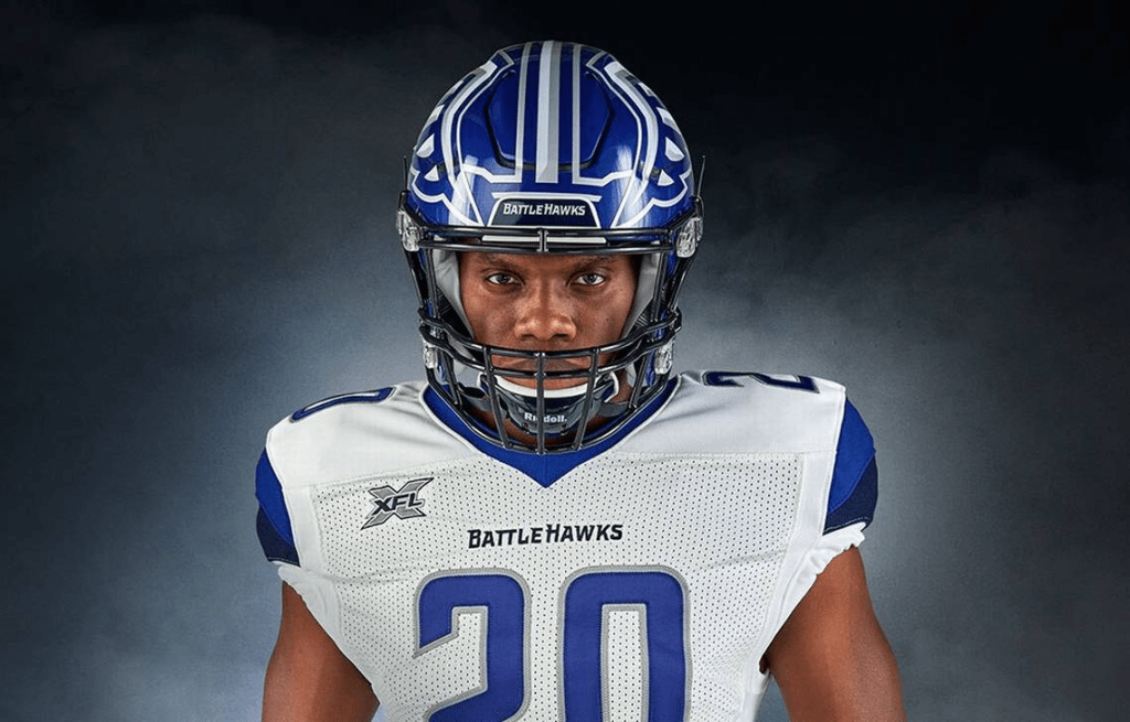
The St Louis Battlehawks have perhaps one of the most die-hard fanbases in the XFL, loudly shouting “Kaw Is Law” from the rooftops. So, it’s probably a good thing the new XFL didn’t mess with this logo too much. It was already one of the best in the XFL, so no reason to mess with success. I will say, this logo looks much better on a helmet than as a standalone graphic (which is why it’s a bummer it’s not fully featured on the new helmets), but a great logo nonetheless. As a bonus, “STL” is hidden in it if you flip it upside down.
2. DC Defenders
For the XFL 3.0, the league took one of the alternate logos from the last Defenders iteration and designated it the primary. I think this was a good decision – the use of the negative space to include the “C” and the star and stripe reminiscent of the DC flag was a great choice. It also, unlike some of the other letter logos in the league, looks nice on a helmet. A good choice of logo with meaning that also looks modern and sleek, while carrying the “defensive” and military identity of the team and the city.

1. Houston Roughnecks
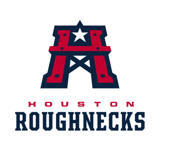
This shouldn’t be surprising to anybody. The Houston Roughnecks logo is a strong, modern logo with both identity and character. The oil rig design hearkens upon the name of the team and the region itself. Is it a bit similar to the Houston Oilers logo – yes, but that was a dang great logo too. Plus, this logo is stylized as the “H” for Houston and includes the Star of Texas, while also being in the colors of the Texas State flag (which is featured nicely on the helmets). By far the best logo in the new XFL – and it improved even further upon the previous iteration, below.
