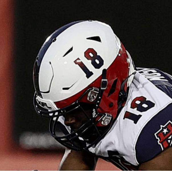
For most of us, fall means football. But, it would be great if we could enjoy those same tailgates and fiery fandoms during the spring too, right? Well, with the merger of the USFL and XFL into the new UFL, under the joint management of the Rock’s Redbird Capital Partners, FOX and ABC, Spring Football is finally back!
The new league contains former USFL and XFL teams. This means a lot of teams will play for the first time, leading to some exciting new uniform and logo matchups. But, who has the best logo in the UFL? We have power ranked them below, and let us know in the replies if you agree or disagree. Here’s our list of the best logos in the UFL:
8. Arlington Renegades
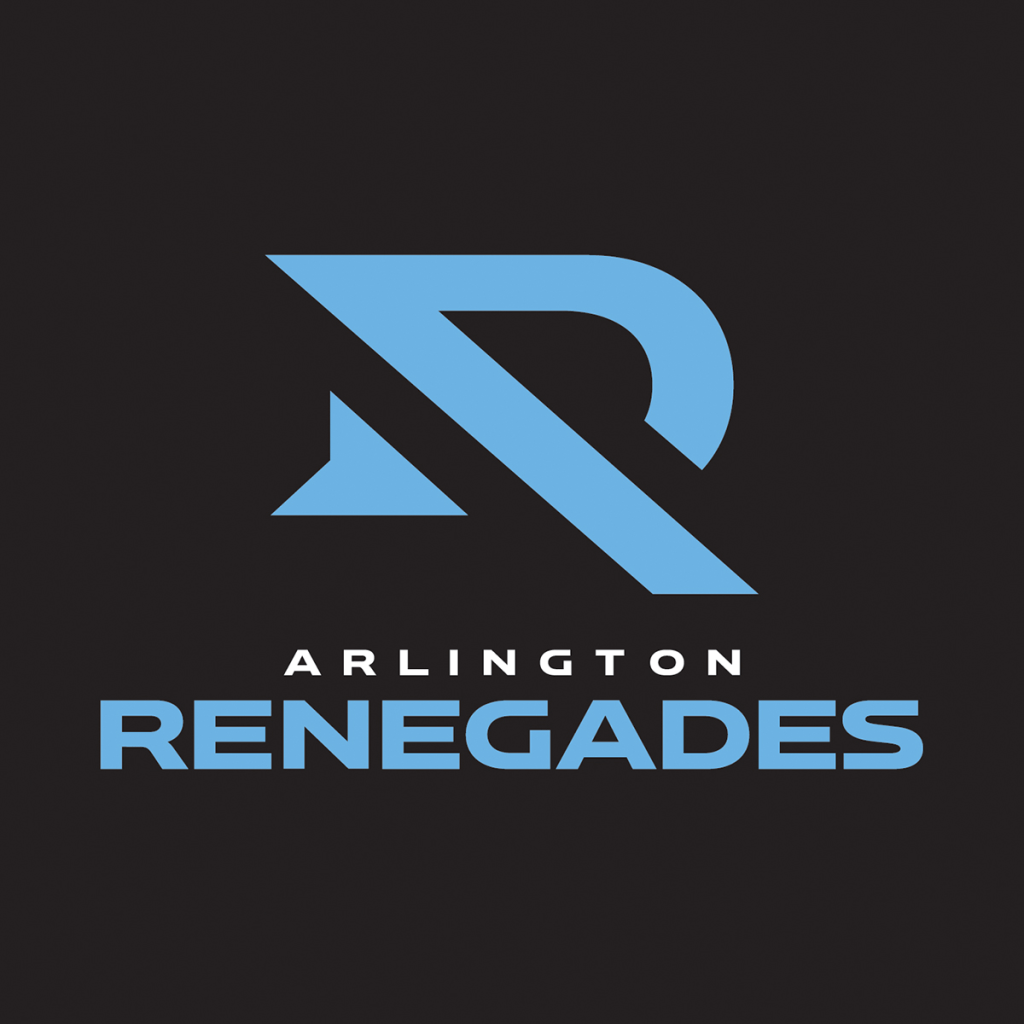
While there has been no official confirmation, there is simply now way this wasn’t designed for the “Dallas Renegades” and, for some odd reason, retained even after the name change. The logo looks much more like a “D” than anything else. In fact, it barely even looks like an “R”. While the Dallas Renegades have to be respected as the first official rebooted XFL Champion (and for having legendary coach Bob Stoops), this logo does not deserve any respect.
To make matters even worse, the Renegades alternate logo would probably be the best in the UFL.

7. Birmingham Stallions
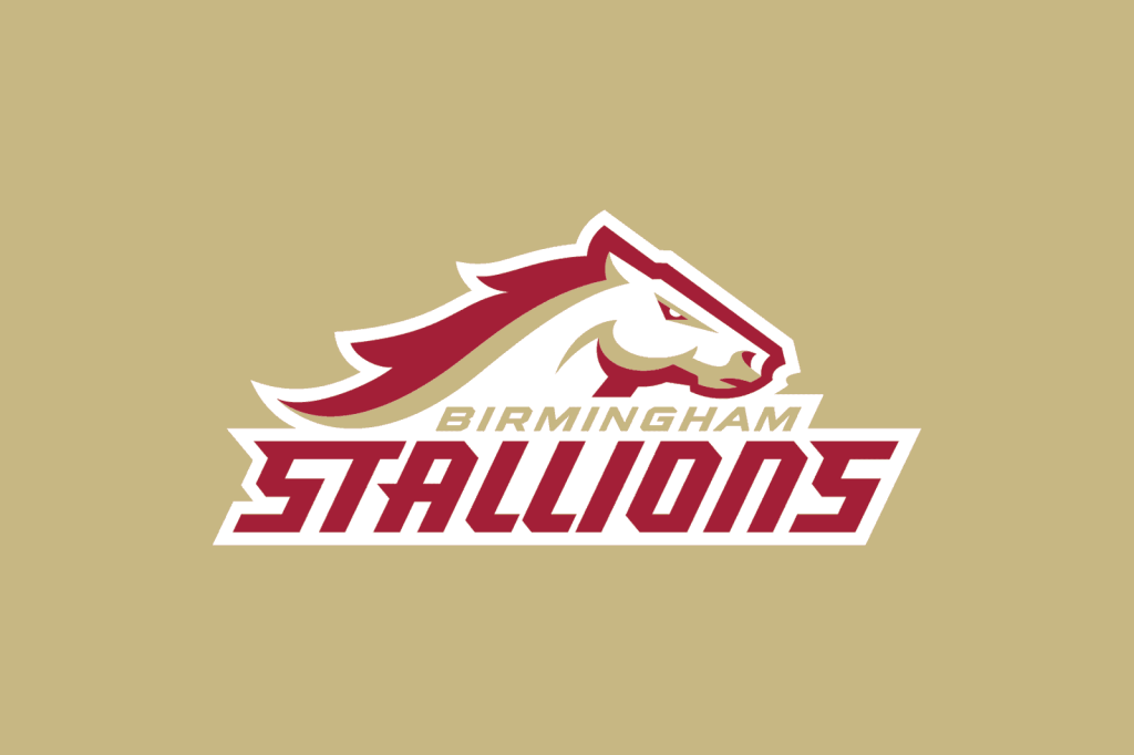
It’s fairly amusing that the two spring league champions are back-to-back in our two lowest rankings, but to be fair, it’s not the first time on field performance has beaten branding. While the Stallions logo is not bad, it’s fairly uninspiring. It’s just a horse with the word mark, and not a particularly sleek horse either. Still, it’s miles above the Arlington Renegades logo.
6. Michigan Panthers

The Michigan Panthers branding, unlike the Birmingham Stallions, is relatively unchanged from the 1980’s iteration of the USFL. The color scheme is unique and looks good on a uniform. The Michigan Panthers logo mostly loses points for the weird trapezoid entrapment the Michigan Panther seems to be stuck in. When freed from this trapezoid, the Michigan Panther looks amazing on a football helmet.

5. San Antonio Brahmas
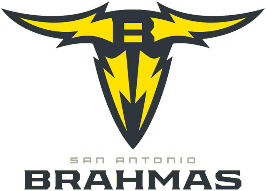
The XFL teams had the opportunity to create entirely new brands, whereas the USFL teams often borrowed from their historical equivalents. The San Antonio Brahmas were not added until the most recent iteration of the XFL, as an ode to the Rock’s wrestler persona. While this logo isn’t the worst, they didn’t entirely stick the branding. The negative space “B” in the logo just feels unnecessary, and it feels like the logo as a whole could have been a lot sleeker. That being said, it’s not the worst, and that’s pretty good for a logo designed after a mix between a wrestler and a football team.
4. DC Defenders

With the DC Defenders logo, we enter the tier of UFL logos that are really solid. In fact, all logos past this point are quite good. Of these, the DC Defenders logo is toward the bottom because it doesn’t really have much to it. But, it’s a simple and recognizable wordmark, and incorporating both the “D” and the “C” into the logo is quite impressive. It is a step up from the original shield logo used by the team.

3. St Louis Battlehawks
The St Louis Battlehawks logo is very cool. That is honestly the best summary of the logo. It’s got a sword, metallic wings, and is quite striking. The color scheme rocks, and the logo translates great to a helmet. The symmetry is pleasing, and almost anyone would happily rep this on a T Shirt. It falls behind our final two logos because they simply knocked it out of the park even further with their creativity and team branding.
2. Memphis Showboats
In general, the XFL logos blow the USFL logos out of the water. How fitting that the only USFL logo to rise above the rest is a boat? Perhaps the other USFL logos struggled because they clung to tightly onto their historic, dated branding and were afraid to take risks. The Memphis Showboats took a completely new approach, ditching their historic branding, and are all the better for it. This logo is fast, fierce, and makes an old-timey vessel look like it’s about to run you over on a football field. This is a fantastic logo fitting a fantastic brand – but we’ll give some love to the Memphis Showboat retro logos as well.


1. Houston Roughnecks

It’s bold. It’s clean. It incorporates the “H” for Houston. It looks like an oil rig, the home of the oil-drilling “Roughnecks” the team is named for. The only mistake the Houston Roughnecks brand has made is not putting this logo on their helmets, as the current state flag domes leave a lot to be desired. This logo was the best in the last XFL, it’s more dated ancestor was the best in the 2020 XFL, and it now is deservedly crowned the best in the UFL. And we’re lucky they went with it despite retaining the personnel from the Houston Gamblers, because that logo is at best the 5th best in this league.

Now please, get this logo on the helmets.
