Image Courtesy of foxnews.com
Last night marked the conclusion of a 2018’s incredible March Madness tournament, with Villanova taking the title in a dominant victory over the Michigan.
But, Divincenzo’s incredible performance and the three’s the Wildcats drained all night weren’t the only things that caught our attention. The uniforms in this match up were crisp, captivating and full of details, something that doesn’t happen often with basketball kits.
Villanova:

Image Courtesy of usatoday.com
As the highest seed in the match up Nova got to wear their home jerseys. I love the Wildcats away uniforms as well, but I’m glad we got to see these last night. The light blue outline on the dark blue text always looks fantastic, and the colors pop even more on the blank canvas of the white jerseys.

Image Courtesy of si.com
My absolute favorite part of these uniforms, however, was on the shorts. Nova brought back their retro Wildcat V logo, and I couldn’t be happier.

Image Courtesy of pinterest.com
Those who follow this blog know I love throwback looks and when retro logos make an appearance, like Duke’s retro-Devil. Nova’s is no exception; how could you not love that ragged lookin’ cat? Plus, the bold V is a neat icon. Louisville also features a retro logo on their basketball shorts, a trend I think more schools should adopt.
As much as I loved these uniforms, they weren’t the star of the night. That goes to the Wolverines.
Michigan:

Image Courtesy of freep.com
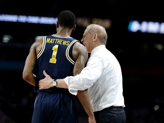
Although Michigan’s on-the-court performance couldn’t keep up with Villanova, I think these uniforms outpaced almost all others this tournament. Dark blue is hard to nail, but these jerseys were bold and royal. The white piping on the edges frames them well, too. The best feature of these kits, however, is far and beyond the lettering.

Image Courtesy of freep.com
The reflective maize numbers and letters stood out under the stadium lights without being too obnoxious. The deep blue surrounding them made them even brighter. Plus, the font used for the names on the back was the perfect simple style to complete this classic look. This jersey could be used 20 years from now or 20 years ago and would still stand out as a classic. I haven’t seen many other basketball jerseys that come close to being this timeless.
Agree? Disagree? Have a favorite tournament jersey you’d care to share? Post in the comments below.
