On September 28, 2017 Russell announced they would cease producing uniforms for football teams.
This didn’t come as much of a surprise since they only had two FBS college football teams left wearing them, Georgia Tech and Southern Miss, who both announced they would be switching to Adidas when their Russell Athletic contracts expired in 2018.
So, in memoriam, we take a look back at Russell Athletic’s history, contributions and mistakes in sports apparel design.
The History:
Russell Manufacturing Co. was founded in Alexander City, Alabama in 1902 by Benjamin Russell. However, they did not produce athletic apparel until 1938, six years after they acquired Southern Manufacturing Company.
During World War II, Russell Manufacturing’s main focus was supplying the U.S. Army and Navy with shirts, athletic wear and undergarments. However, they continued to expand their athletic wear production during this time and by the 1960’s would become the largest sports apparel manufacturer.
From the 70’s onward they began to dominate many sports leagues as uniform of choice. 18 of the 28 NFL teams during this era sported Russell at some point, including the New England Patriots, Dallas Cowboys and Green Bay Packers. The corporation signed a five year deal to become the exclusive producer of Major League Baseball uniforms in 1992, which was expanded until 1999. Between 1999 and 2004 (when Majestic took over) there was no sole supplier of MLB kits, but Russell continued to supply many. Russell also had deals with Little League Baseball and the Harlem Globetrotters.
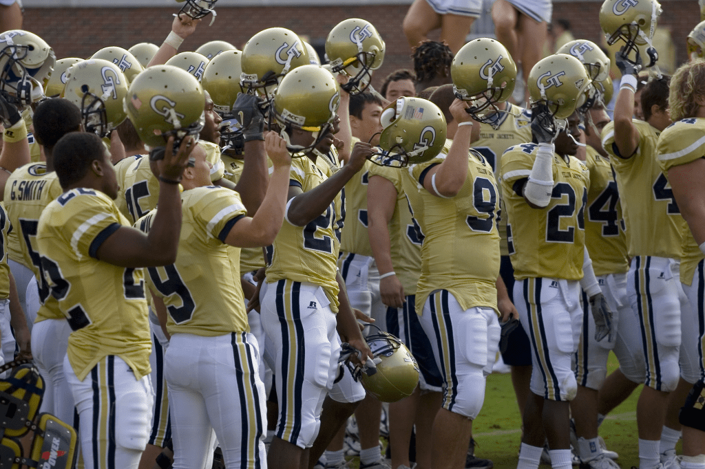
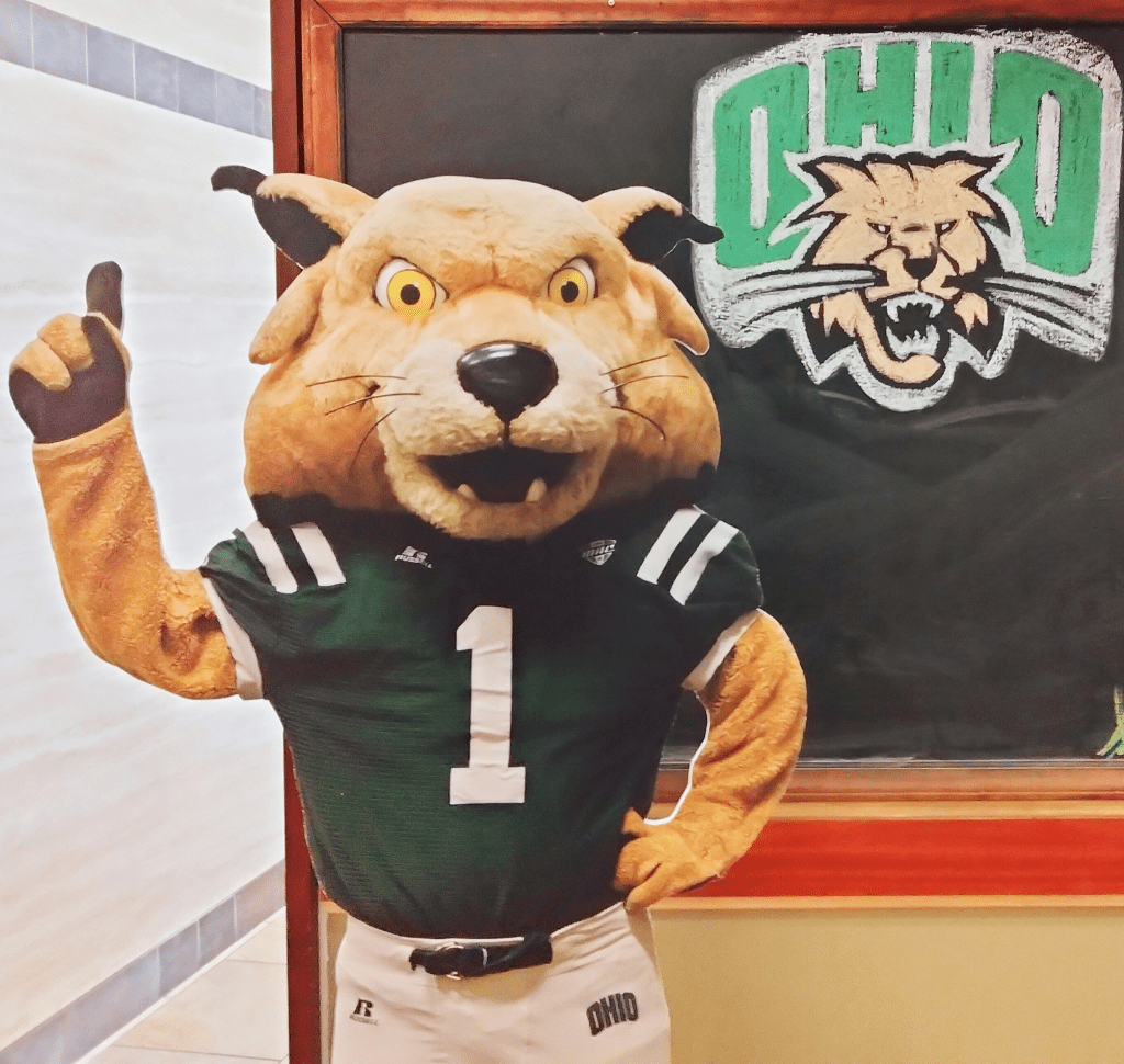
As far as college football, current FBS teams that once donned Russell Athletic include Coastal Carolina, Washington State, Western Kentucky, Ohio University, Southern Miss and, of course, Georgia Tech.
However, Russell’s partnerships waned throughout the 21st century until we got to where we are today. Russell has announced that they plan to focus their resources on providing consumer apparel, and will cease producing team uniforms for any sport.
The Highlights:
While most won’t remember Russell uniforms fondly (especially Yellow Jacket fans), there were some diamonds in the rough. Here are some of our favorite past kits from the manufacturer:
Western Kentucky: Boca Raton Bowl, 2016
This uniform might be one of Russell’s most memorable, and not just because of WKU’s 51-31 victory over a strong Memphis team. WKU’s helmets are one of the few chrome domes I approve of (another being Memphis’ striped buckets), and the bold black and red on these jersey supported them without overshadowing them. I think the black and white shoulder striped looked great with the numbers and black pants. This was a great victory for both the Hilltoppers and Russell.
Ohio University: vs. Eastern Michigan, 2012
If you’re a close follower of our blog you know I’m a huge fan of “color rush” uniforms; and this 2012 Bobcats kit is no exception. It’s such a beautiful shade of green on these bad boys, and it looked even better matched up against Eastern Michigan’s white background. Russell stuck to the basic here, but the simple all green look definitely made an impact. Only flaw here, in my opinion, are the white/black/white shoulders, but they don’t detract enough to take away from this overall stunning kit.
Georgia Tech: Orange Bowl, 2014
This one might not be as stunning as the last two, but it was one of the acceptable uniforms Russell ever put out for the Yellow Jackets. Why? Because Georgia Tech’s colors are white, *gold* (old gold, if we’re being nit-picky) and blue. Russell really struggled with the concept of gold, and for some reason used what I can only describe as p*$$ color. Here, however, we get a brilliant blue and a real gold color, at least on the helmet. The pants were fine, too.
The Lowlights:
Yes, what we all came for. The true eulogy for Russell Athletic. Here are the worst of the worst.
Southern Miss: vs. FAU, 2013
I genuinely do not even know where to begin. Digital camo has long been trying to worm its ugly way into athletics, with no signs of stopping (I’m looking at you, San Antonio Spurs). But this is truly one of the worst. If they had gone for solid black with the camo accent it might’ve been somewhat redeemable, but these kits just look like a West Virginia uniform if I was watching the game while on salvia. I hope Adidas treats you better, Golden Eagles. Just please, no tire treads.
Georgia Tech: Chick-Fil-A Bowl, 2008
Yes, these uniforms somewhat capture the blue and gold, but…no. The shoulder spread looked absolutely atrocious, separating the jersey into a strange top half and bottom half look. This kit looks like mustard stains all over a Penn State uniform. The gold on the sides looks terrible as well and certainly doesn’t help the cause. Georgia Tech should’ve stuck to it’s classic looks, and at most used it’s honeycomb alternate pattern. Tech, I hope Adidas treats you better too.
Ohio University: vs. Miami-Ohio, 2013
While I always appreciate special looks for a rivalry, this didn’t do the Battle of the Bricks justice. The brick pattern came out looking more like a loosely-applied stamp, and was done in the absolute ugliest shade of green possible. Green and white are classic colors and Ohio has some of the best branding in the MAC, so it hurts me to see Russell disrespect them like this. This was a neat concept too, ruined by an inept athletic apparel company.
At least you can’t hurt us anymore, Russell. Goodnight, sweet prince, and good riddance.

gonna offer a minor correction: the jerseys you listed as Georgia Tech’s highlight were worn during the 2014 Orange Bowl (note the jersey patch) and not the GT-VT game you described
Tech did wear some nice clean throwbacks vs. VT in 2015 though: https://gtswarm.com/photos/20151112/virginia_tech_vs_georgia_tech_0129.jpg
i’d actually forgotten Georgia Tech had worn blue at all for that game….. but the 2015 football season did make me drink a lot, so
LikeLike
Updated, thanks for the catch. And sorry about 2015…
LikeLike
In the 2008 Chick-fil-A game there is a mention of Georgia State… Think that is supposed to be. Georgia Tech.
LikeLike
Updated.
LikeLike