After an overwhelming victory in our Twitter poll, this week’s TuesD3y Spotlight belongs to the University of Dubuque Spartans.
The University of Dubuque is a small Presbyterian university in Dubuque, Iowa. They have played football in the Iowa Conference (IIAC) since 1929, but fielded a football team for years before that. They hold 8 IIAC championships, with the most recent from 2015 when they went undefeated in conference play for the first time since 1979.
They have an incredible history but also continue to make headlines today, most recently by sending cornerback Michael Joseph to the Senior Bowl; the only D3 player in the game. But of course, this isn’t a blog about history, it’s a blog about design. And boy, do the Spartans look great when they hit the field.

The Spartans standard kit is a crisp Under Armour uniform, showcasing their signature blue and white. I think the blue/blue/white uni shown above is their best look. The way the metallic blue helmets and silver stripes go together just looks bold on the field, making them look like much more than just another D3 football team.
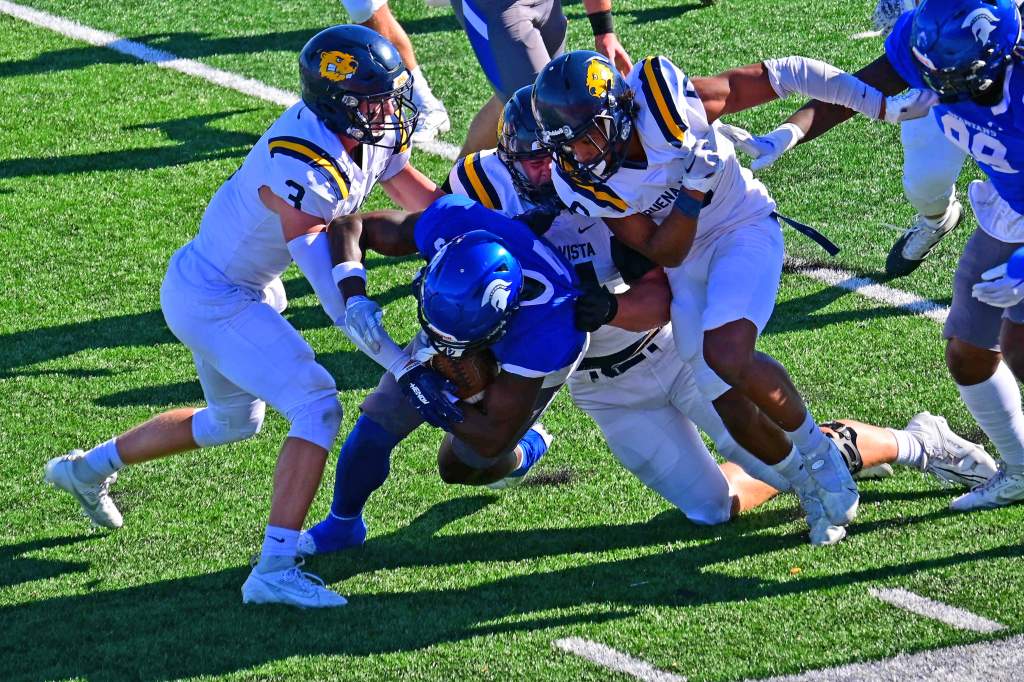
The blue jersey can be switched out for white, which is more suitable for away games. Thankfully the metallic blue helmets still make an appearance. I think they’re the highlight of Dubuque’s uniforms and one of the most subtly iconic in the Division.

Again, the chest stripes (now blue) just pair perfectly with the helmet and pants to tie the whole kit together.
Interestingly, the Spartans have also taken the field in a gray jersey. I must admit I’m a pretty strong opponent of gray tops, whether it’s KU’s gray abominations or even the Boston Celtic’s “The City” jersey. So naturally, this wasn’t my favorite.
That being said, I think these were done just about as well as they could have. I definitely prefer the blue/gray/gray’s to the blue/gray/blue’s I’ve also seen. I draw a strong parallel to Duke University’s “Hellraisers” kit we looked at in our Retro-Devil blog post.
If Dubuque is seeking an alternate look, I’d love to see an all white with white helmets. D3 schools aren’t always able to switch out their helmets, but I think it’d be fantastic to see a metallic blue Spartan with blue chest stripes popping on a snowed-out look.
Speaking of the Spartan, huge credit for Dubuque for executing one of the most difficult tasks of any small school; overcoming a popular branding of their mascot. While Michigan State and their iconography will always come to mind when thinking “Spartans,” Dubuque keeps their logo different enough with details such as the crest and neck line to maintain their own identity. Plus, when fully integrated into the “UD” logo it looks splendid.
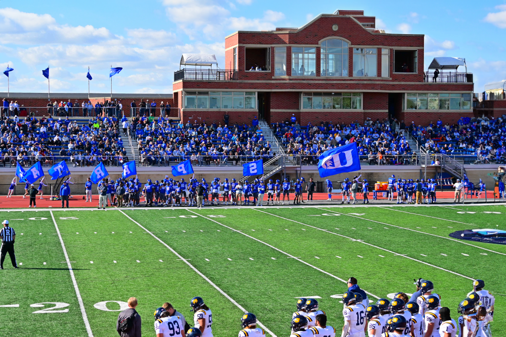
The Spartans play at Chalmers Field, a 4,000 capacity stadium. The real highlight of this venue is the press box, completed in 2008 and one of the best looking I’ve seen for a school of this size. Plus, it integrates fantastically with other campus architecture.
The University of Dubuque Spartans are one of the most consistently crisp looking D3 brands. Definitely keep an eye out for Michael Joseph in the NFL Draft, and the Spartans as a whole in the coming years. They’re a program with the talent and potential to become a powerhouse and eventual title contender.
Enjoyed this TuesD3y Spotlight? Check out last weeks, where we review the Tufts Jumbos!
