In early October 2025, Mike Repole and the United Football League announced that the Michigan Panthers, San Antonio Brahmas and Memphis Showboats markets would be closing / relocating to make room for three new teams. These were announced as the Louisville Kings, the Columbus Aviators and the Orlando Storm. Furthermore, the Houston Roughnecks were rebranded to their USFL equivalent Houston Gamblers (including with a refreshed logo) and the Renegades reverted to the “Dallas Renegades” and their original logo.
When the UFL first launched after the merger of the XFL and the USFL, we ranked the logos of all eight teams. So, it’s only fitting that we re-rank with these updated teams and brands. Without further ado, these are the definitive rankings of the new UFL team logos and brands.
8. Birmingham Stallions
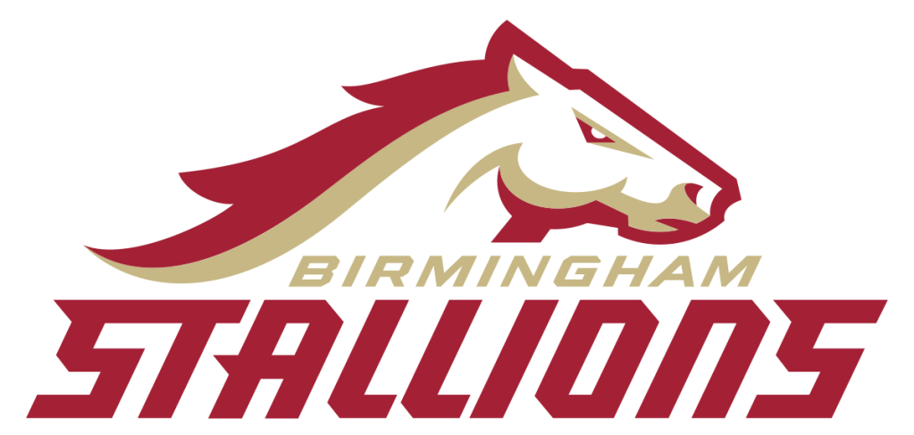
Now that the Dallas Renegades reverted to their original logo and title (as we requested in our previous article), the Birmingham Stallions slide from the 7th spot to dead last. It’s not personal – the Stallions simply have the blandest logo of the bunch and it doesn’t really translate great to uniforms either. Worry not, you can comfort yourself with your trophy case.
7. Orlando Storm
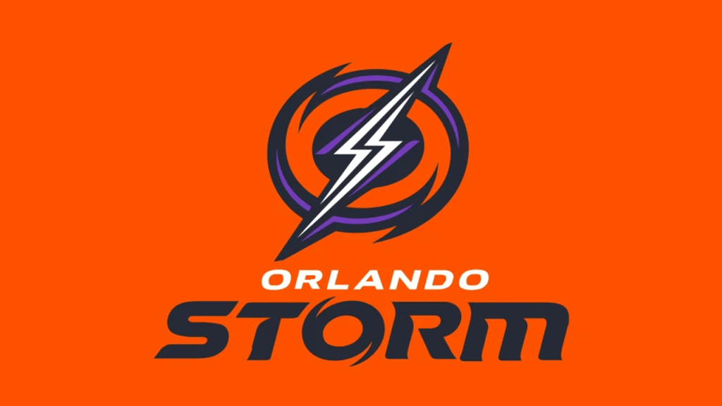
The first of the newbies in our list. Here’s the good news – it’s not a bad logo, and that’s more than we could say about the Arlington Renegades, Birmingham Stallions, Michigan Panthers and San Antonio Brahmas in our previous rankings. So, already, the UFL rebrand is an improvement. But, ultimately, the Orlando Storm most give “Arena Football”, though the seemingly subtle nods to the Orlando Apollos of the AAF will help this team find a home. The “O” in the logo is a nice touch too.
6. Louisville Kings
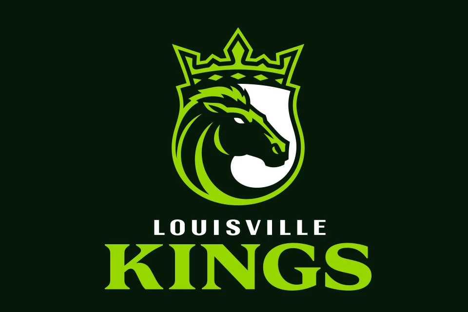
This is probably the most controversial, not just of the new logos, but all of the UFL logos. While I think the Orlando Guardians of the same color scheme were just an abhorrent take on team branding, the Louisville Kings at least kind of stick the landing. Plus, the ties to Louisville (named after a king and horse racing history) are clear, not to mention Repole’s ties to Horse Racing. But, that big blob of white space in the logo just looks unpleasant, and once you notice it you can’t look away.
5. Columbus Aviators
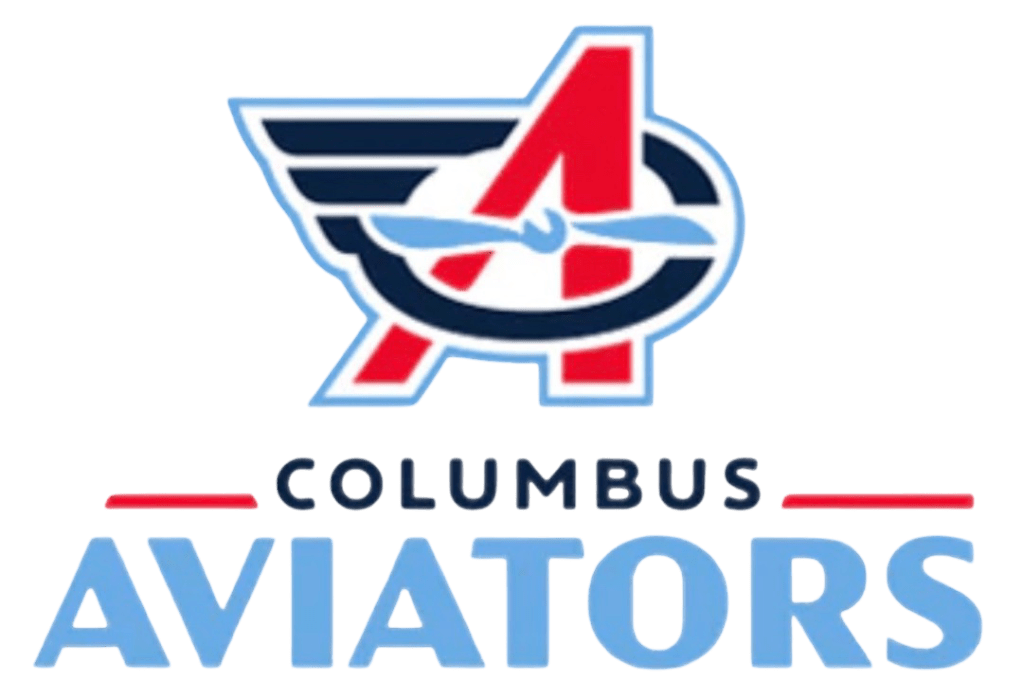
The best of the new teams. It’s a little busy, which keeps it a little low on our list, but it incorporates a nice winged “C” and the “A” without doing too much. Given the expected ties to Ohio State, you would imagine they lean into the red much more than they lean into the blue. Curious to see how this looks on a helmet, but for now, it’s the winner of our rookie class. We aren’t docking points for it, but many are accusing it of being too similar to Dayton.
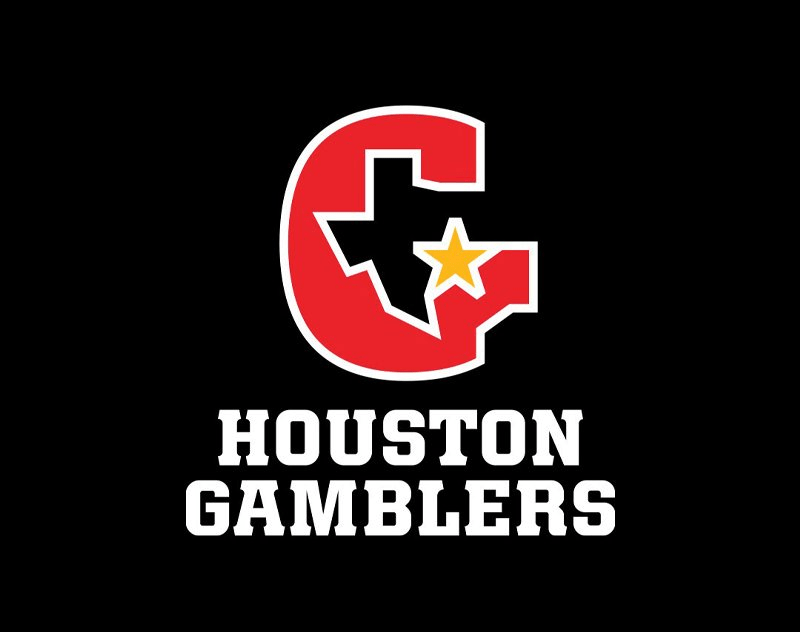
4. Houston Gamblers
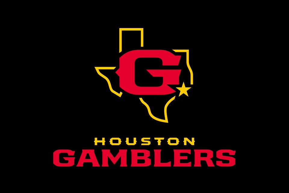
This logo is competing with the Louisville Kings for the most controversial. Many are appalled that they didn’t retain the USFL era, shown below, as it was a really clever way to incorporate the “G” and the state of Texas outline. Personally, this logo looks a lot cleaner, though it did lose some of that charm. It will be flash on a helmet. But, of course, we mourn the Houston Roughnecks, who took the Gold Medal in our previous rankings.
3. DC Defenders
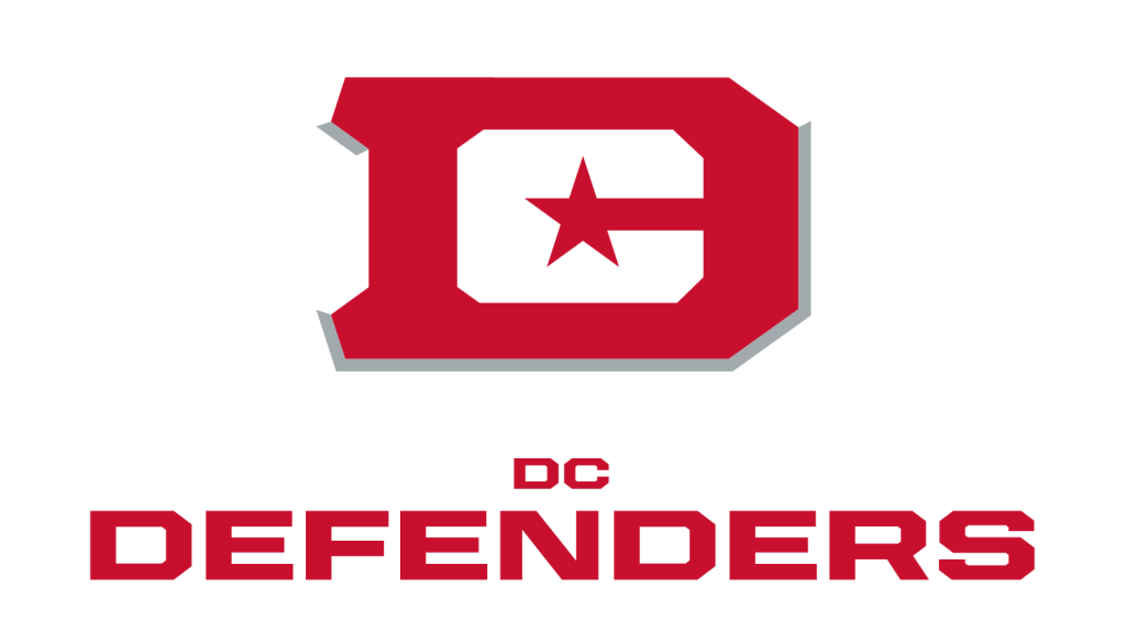
The DC Defenders benefit from the departure of the Houston Roughnecks and Memphis Showboats and take the #3 slot in our new rankings. There was a lot of push back on our #4 ranking, but while clean, the DF Defenders logo is ultimately a bit to simple. That being said, it has certainly become iconic over time now that the Defenders have a championship to their name, and it’s still a step up from the original shield logo, but it would benefit from having a bit more character. A respectful Bronze Medal.
2. St Louis Battlehawks
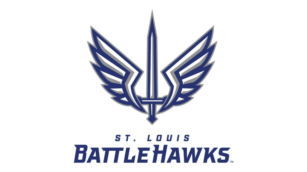
Despite the departure of the Houston Roughnecks, the St Louis Battlehawks stay put in the Silver Medal position in our rankings. It is a killer logo, and it looks the best on a helmet. It is probably the most iconic of the logos in the UFL, and immediately evokes their passionate fanbase and the resilience of the city. I do prefer the original XFL version (shown below), but this is still a top class logo. Don’t forget that flipping it upside down spells STL!
1. Dallas Renegades
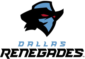
What a GENERATIONAL turnaround. It’s not often sports teams do what the fans are begging for, so shoutout Mike Repole and the UFL for fixing one of the worst atrocities in sports logos history. The Dallas Renegades logo is badass, exudes winning energy and looks great on a helmet. Most importantly, it’s beloved by fans! If you want to be disgusted, look at the previous logo the Arlington Renegades used below (which didn’t even make sense, since it clearly had a “D” in it). We are over the moon to see the best logo in UFL history return to the league – as we had passionately requested!


LikeLike